
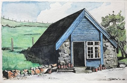
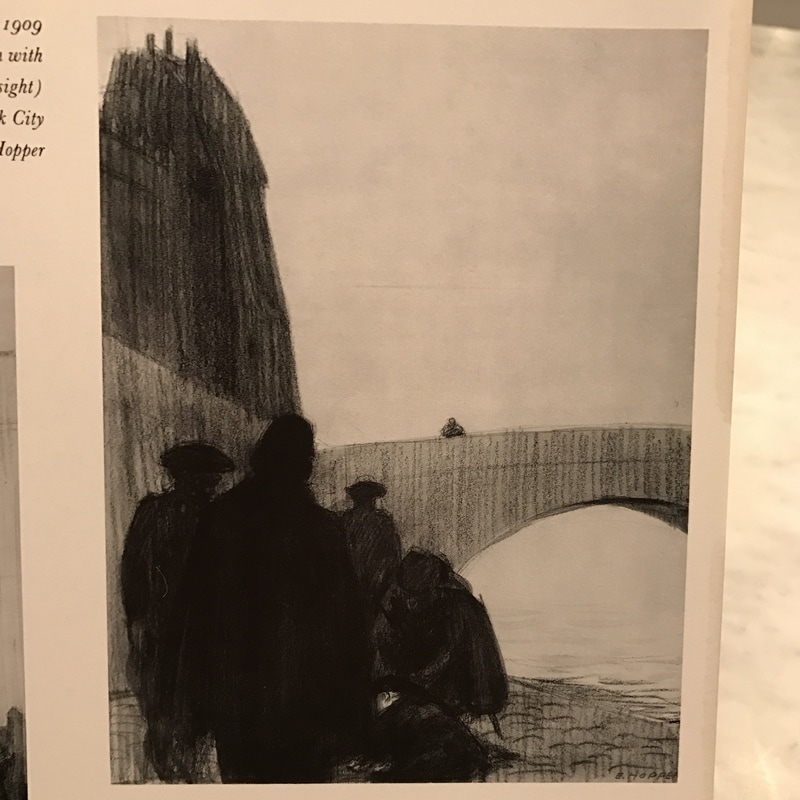
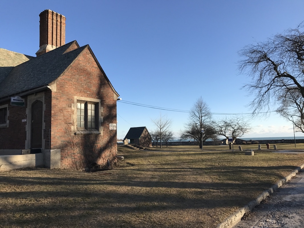
 Edward Hopper (1882-1967) made beautiful shapes out of shadows. You notice it best in his etchings (see below). Big, dark masses that emphasized compositional design and added just a drop of “poison.” By his hands, those shapes went further to create a sense of brooding or mystery, even. I chose to paint this snapshot (pictured above) from a trip to the Isle of Skye because of the big, dark shape created by the side of the building and its shadow on the grass. I love that shape. I love its size, its density, its contrast to the bright sunlight, its encompassing nature that obscures the line between building and land. It reduces the area to a wonderfully shaped mass—the hard angle of the roof and the prickled, natural edge through the grass. This reduction adds a touch of abstraction to an otherwise strictly representational picture. I wish I could paint shadows like that all day long. Hopper was a student of Robert Henri (1865-1929), who taught the importance of identifying the major shapes in a picture and getting those right before moving on to anything else. For Henri, it was a matter of being organized (“A good painting is a remarkable feat of organization.” Amen.), and by establishing the “four or five largest masses” one could map out the picture and make better, easier choices in the details. “When we know the relative value of things we can do anything with them” (Henri, The Art Spirit, 1923)
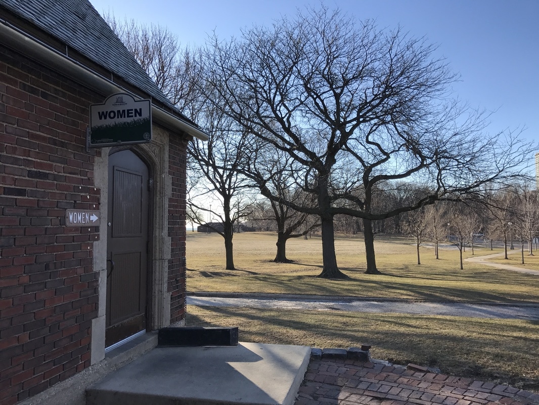
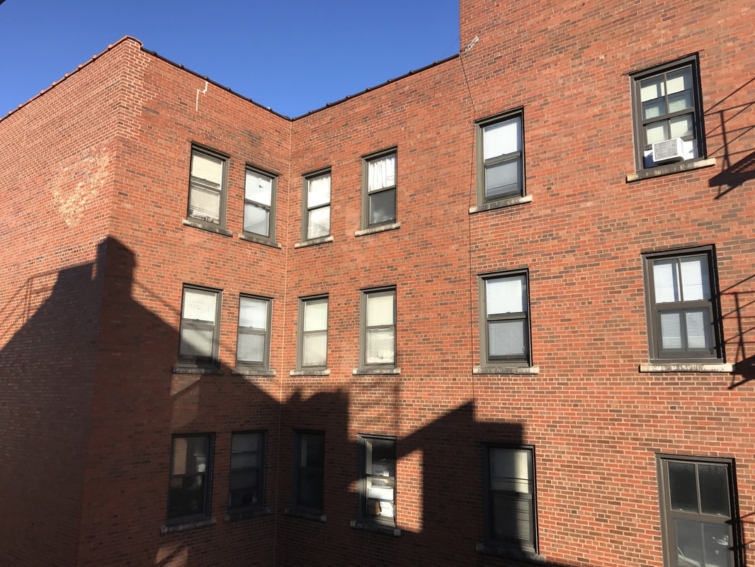
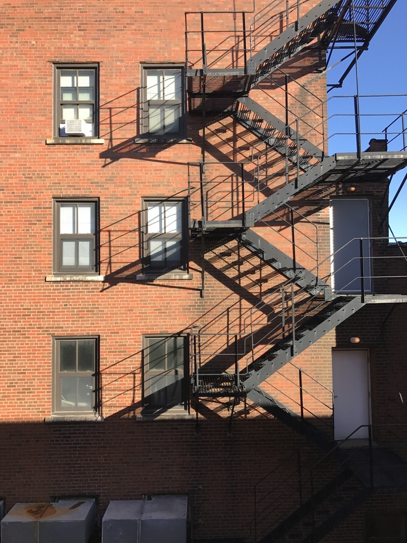
Over in France, with a little career head start on Hopper, Henri Matisse (1869-1954) was painting stunning compositions with masses of color. He still employed strict draughtsmanship, but he pushed his shapes further toward abstraction. I wish I could paint like that all day long. Very different painters in style, but all three wanted to depict the essential character of their subjects, and to get there they used the essential elements of design. I have trouble sticking to my “essentials,” and one of Henri’s suggestions is to paint quickly, after establishing the larger masses, of course: “Do it all in one sitting if you can. One minute if you can. There is no virtue in delaying.” Okay! Many painters past and present said/say that they are merely chasing light when they look for the subject of their next painting. Maybe the Impressionists come to mind first. Manet summed up his motivation: “Look for bright light and deep shadow, the rest will come naturally,” (Neret, The Impressionists, p. 7. 1985). Fifty or so years later, Edward Hopper said that all he wanted to do “was to paint sunlight on the side of a house” (Goodrich. Edward Hopper, p. 31. 1993). You can’t beat nature’s lighting effects, and as cheesy as it sounds to be a light chaser, I find it to be pretty true. In fact, two days ago, I found myself literally chasing it, in my car, and I had a good laugh at myself. I had just dropped off my son at school, and at 7:50 a.m. in February Chicago gets that bright, yellow, clear winter-morning light that makes every building glow. I was entranced, and I didn’t have any errands, so I drove, not sure of my destination but hoping I could find a parking spot wherever I landed. I had wanted to find a vantage point high enough to offer a closer view of rooftops and a birds-eye view of the morning’s long shadows. But in this flat, dense city what I need is a friend with a penthouse. Instead, I followed the path of least resistance during rush hour, driving north on Lake Shore Drive. I took an exit toward the lake to Marovitz golf course and the handsome Lincoln Park Fieldhouse (empty parking lot!). Although The Light was hitting that big old Gothic building, I didn’t have the point of view I wanted. I took a bunch of pictures (the best being of the low-slung, A-framed women’s restroom that juts out to one side, pictured) and may piece together a composition. The trees in the park offered the height and shadows I was searching for, but, like Hopper, I was hoping for the broad side of a building. I left when I couldn’t feel my toes anymore, and I went to the grocery store for a breakfast burrito. I have been up on top of its parking garage many times, but this day I caught a view in between levels onto a bright, red-brick building and pulled over. I walked closer and took more photographs of the stunning colors and shadows. Found it! I heard an art critic quote painter Lucian Freud: “Every picture should have a drop of poison in it.” This sums up how I measure the success of my own paintings. I did a beach scene last summer, and when I thought I was finished—that is, I had painted what I saw—something was off. Or rather, nothing was off. It was picture perfect. Boring. It had no poison. Lucian Freud’s paintings are dripping with poison. His broad, rich brushwork and draughtsmanship of the figure are gorgeous, but his “pitiless observation” (The 20th Century Art Book, p. 148. 1996) of his subjects creates discomfort and tension on many levels. Even his non-figurative works have it. I remember Two Japanese Wrestlers by a Sink hung in the office of the director of the Art Institute when I worked there. It’s a picture of a dirty sink—instant poison. But it is so beautifully rendered, I can’t help but like it on a painterly level. My own work isn’t focused on emotion or message, so the only drips of poison in my paintings come from elements of design. Composition, strong light and shadow, color contrast, impulsive brushwork. I like Freud’s quote because he 1) verbalized what I think many people can’t put their finger on when they’re viewing art and 2) acknowledged that it doesn’t take much drama--your efforts don’t have to be overt--to make a picture interesting, just a drop.  Yesterday I finished a small pastel landscape. The reference photo is a view from a hilltop across a green Tuscan valley. It’s a typical stunning view of such a landscape. It is a great photo, and there was nothing I did with pastels to make the picture better or different. Edward Hopper had the same feeling about New Mexico. He was “miserable” there in the summer of 1925 because everything was too beautiful and from his standpoint unpaintable (Goodrich. Edward Hopper, p. 85. 1993).
I usually start from the other side—seeing something ordinary with interesting elements and trying to make it transmute it with paint into a wholly pleasing picture. But I’ve been trying landscapes lately, and some of them have just been too pretty. I know that is because my source photos right now are culled from vacation snapshots. And THAT is because it’s winter in Chicago. BUT! (Wait for my next post on how I motivated self to get out of car in below-zero temperatures.) |
I Heart Art
I do! I make it, sell it, think about it, look at it, read about it, and (sometimes) I write about it. Join my mailing list, and you'll receive my brief--promise--messages about new work, shows, events, and a little inspiration. Probably a picture of my dog, too. 
In front of a mural of a Tim Rietenbach painting in Columbus, Ohio
Archives
April 2023
|

|
|
© Amanda Brodie Stenlund Fine Art, LLC
Proudly powered by Weebly
|