
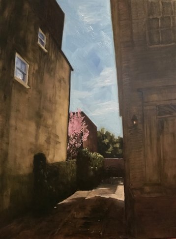
 I thought I would attempt an abstract style with this subject, from a snapshot I took walking through Charleston. That bright pink tree caught my eye, and I wanted to create a picture with a slash of pink to show the arresting nature of that moment I experienced. I did the opposite. I drew with tight perspective and moments of precise detail. However, I did change my technique. I tried something I hadn’t done before: glazing. You use thin layers of paint—darker over lighter--on top of each other. It takes patience and time (also not my style) because you need to let each layer dry completely.
This used to be the typical way to paint a few hundred years ago because of climate and materials. Thin layers worked best with slow-drying oil paints in cool, damp Europe. But I also think thin layers were necessary for the style and purpose of painting then. Painting was the only visual documentation, so realism was important, and that was achieved with viscous paint handled with delicate brushwork. Fast forward to 2017: I was looking for a way to create large areas of monochromatic shadow that looked rich and deep instead of muddy. I got out my reference book, The Painter’s Handbook (Mark David Gottsegen) to see if glazing was the answer. I tried to figure out what transparent colors I had in my paint box (it’s not just written on the tube—thankfully Mr. Gottsegen made a chart in his book), and I gave it a try. I drew the details of the foreground buildings with burnt sienna. Let it dry. Then I went over the whole foreground with a light wash (using a paper towel) of the same color. Let it dry. I created a second wash mixing Hansa yellow light, burnt sienna, and a teeny bit of black. I applied it with a wide brush then used a paper towel to rub away some areas to make them lighter. I was surprised at how well the technique gave the effect I wanted, especially on the left building. What I didn’t realize when I started is that the look I needed for my shadows was luminous, but that’s exactly what I got.
1 Comment
|
I Heart Art
I do! I make it, sell it, think about it, look at it, read about it, and (sometimes) I write about it. Join my mailing list, and you'll receive my brief--promise--messages about new work, shows, events, and a little inspiration. Probably a picture of my dog, too. 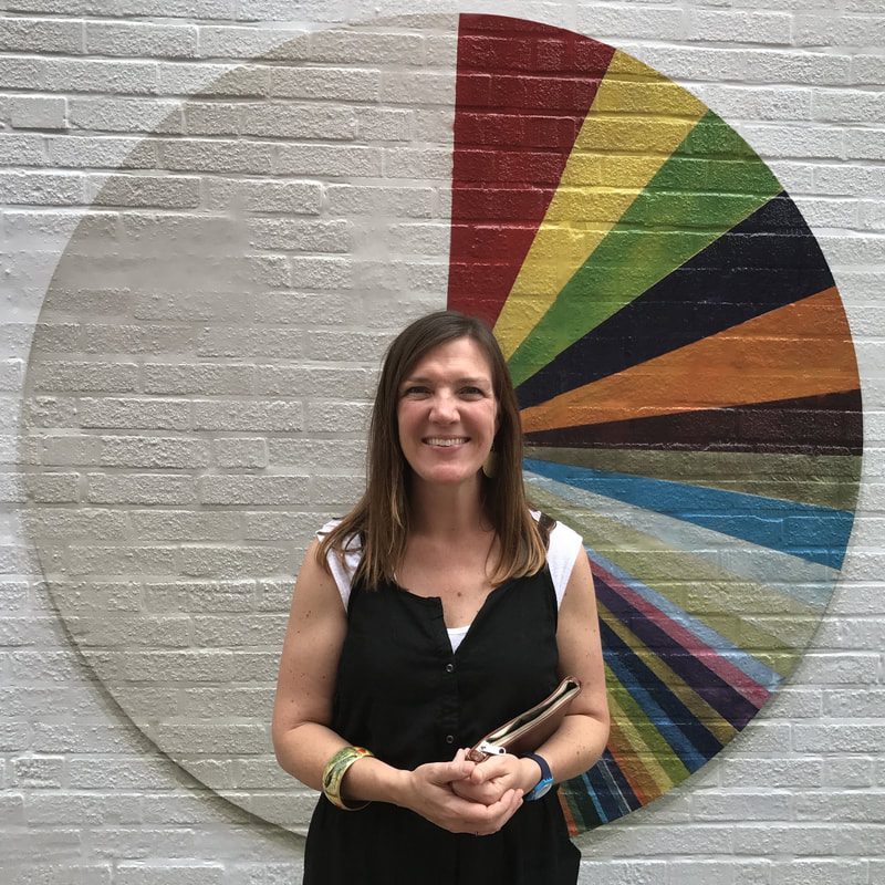
In front of a mural of a Tim Rietenbach painting in Columbus, Ohio
Archives
April 2023
|
|
|
© Amanda Brodie Stenlund Fine Art, LLC
Proudly powered by Weebly
|