|
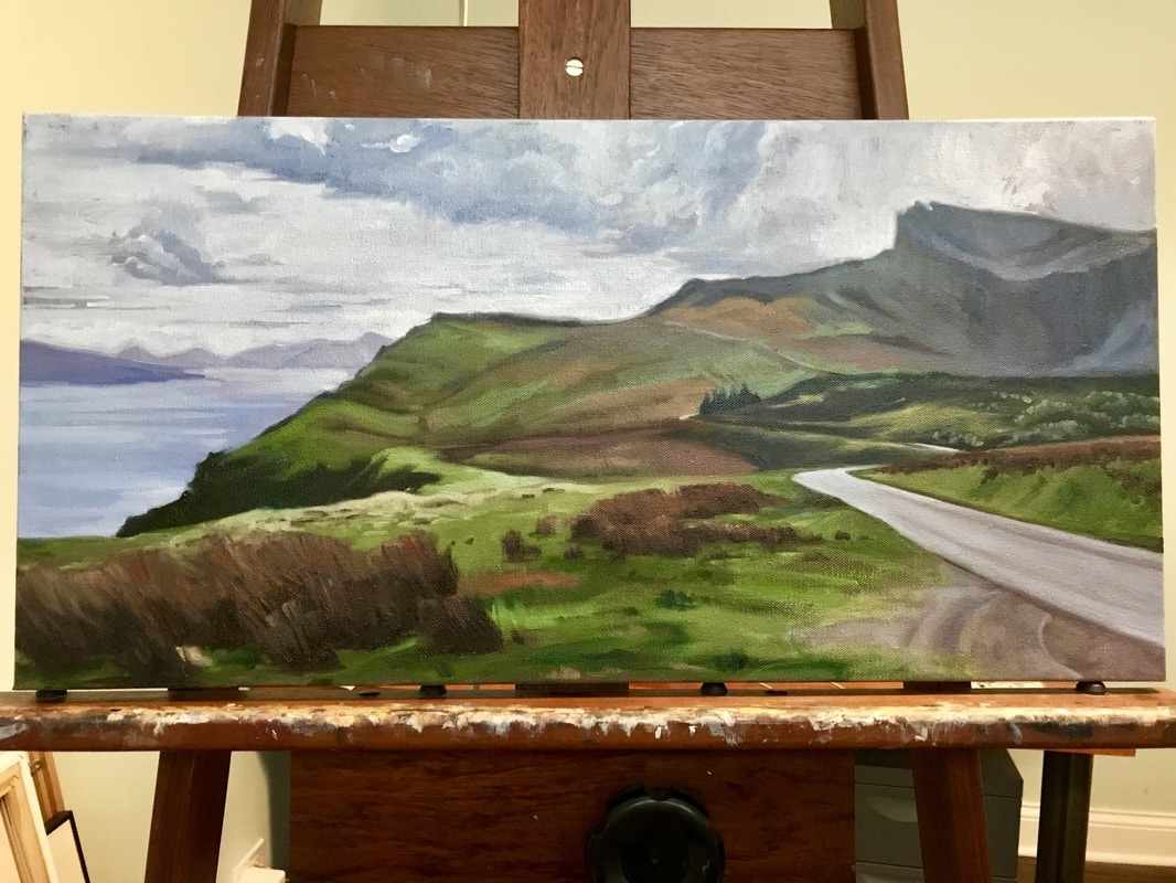
I started a landscape oil painting last week of some soft green hills and cliffs from a snapshot of a trip to the Inner Hebrides of Scotland. I was excited about the composition: I had captured a small road running over and around the area, and the silhouette of the cliffs cut out some great negative space against the sky. I sketched it out and blocked in some color. Then I walked around my house for almost a week questioning my purpose as an artist and a human being.
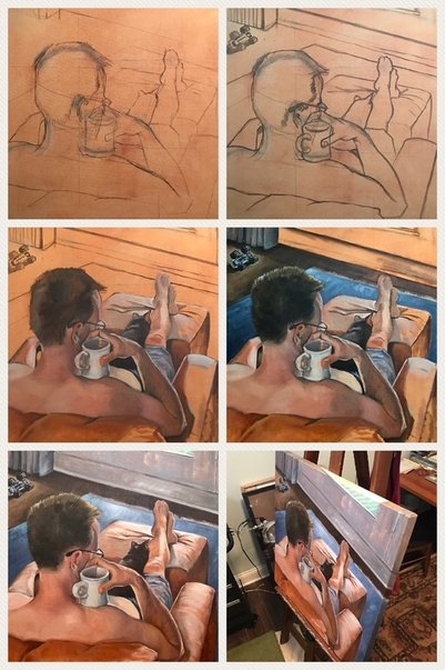
When I hadn’t come up with any answers I finally slinked over to the canvas to do something. Anything. I didn’t want to abruptly end my painting renaissance IN THE MIDDLE OF A PAINTING [whisper voice:] like I did last time. During my week of self-exploration and apathy I read a great article in the Artist’s Magazine all about painting with greens by Michael Chesley Johnson. Coincidentally the subject of his example was in Scotland, too. Aah, the Isle by the Emerald Isle. Landscapes used to be difficult for me, and I realized recently that a big part of that was differentiating masses of green and knowing how to temper the greens with other colors. Green is everywhere, dammit! I mean, the color even has its own movement. So after reading Mr. Johnson’s helpful green color chart and numerous tips, and after an internal “eh, what the hell else am I going to do,” I jumped back into my Scottish scene. The first greens I mixed were on the dull side, planning to build up lights as needed. This is a scene with a lot of distance from foreground to background, and I’d need to create some dramatic depth with a great range of hue and tone to get all the way to the top of the mountain. It’s also a cloudy day, so my bright greens are few. I laid down some good colors on the first pass, having mixed my greens with ultramarine blue, cadmium yellow, Hansa yellow light, Alizarin crimson, phthalo blue, and white. This was a really good greens primer for me, as well as a career primer. Everybody gets in a rut, even if you like your job. I think I felt this one hard because I don’t have the routine and interruptions of an office setting. Though my cat comes into the studio and screams at me at least twice a day. I faced it head on. I’m not completely through it, but I think if I schedule a quarterly review with myself I’ll get myself back on track in time for annual bonuses. And I am a generous boss at bonus time. After a fruitful year of painting small canvases of landscapes and still lifes (fruit-ful!), I wanted to get back to my favorite subject—the figure. The big figure. This was my thing in high school (I could have had an entire exhibition of paintings of my teenage sister), college (mostly drawings), and then during that brief painting resurrection around 2005. I did a few figure paintings when I started up again a couple years ago, but I hit a wall when I was working on one of them. I had to stop, remove it from the room, and lean it against a wall with its back to me. About this time, I had also picked up Carol Marine’s book Daily Painting, an inspiring read by a woman who, like me, had been an art major, got exhausted with the time and energy of working big and thus worked infrequently, then had a baby and had to change her schedule altogether. Her answer was go small. And, like her, I found it to be liberating. Smalling (I made up that terrible word) has been a great exercise in experimentation, speed, and practice, but I missed my biggies.
I pulled out a photo I took two years ago and a 30-inch-square canvas I bought two years ago (for that photo). I wondered if I’d approach this painting differently after a year of trying new techniques and materials, as well as tons of reading about and by artists. Yes and no. New I changed some of my materials. I had been using Turpenoid as an all-in-one substance for brush cleaning and paint thinning, and I forewent a medium altogether. I bought some new stuff and set it up using the Goldilocks organizational method: A big jar of brush cleaner, a medium jar of medium (heh heh), and a baby jar of straight mineral spirits for erasing and thinning. I used a much lighter layer of paint to tone the canvas--I used to slather it on—then I lightened it more by wiping it pretty good with the mineral spirits. The lighter layer was just as helpful plus it dried a lot faster. I worked quickly to get paint down on the largest areas in the foreground, and I painted outside of my lines so that I could carve out shapes with the abutting paint colors. I wanted to be looser and get some more energetic lines. I thought that if I weren’t trying to literally stay in the lines then I’d loosen up. Although I wasn’t going for Impressionistic style, I did want looser brushwork. I put the most work into the focus of the painting: the head, cup, and hand. This area contains the most color subtleties, greatest areas of contrast, and the most detail. If I failed with some passage after a couple of tries, I wiped it clean with mineral spirits and started over. This, instead of trying to make it work with more paint, which can in turn make color muddy and paint layers uneven. I varied my brushes to try new techniques. Turns out that my old bright works great for making a spikey, shorn haircut. Same I spent a lot of time getting the drawing right. I outlined it with a thin layer of raw umber, and I stared at that for a long time before putting down any paint. I had chosen a point of view that anyone in my family would recognize—as if I had snuck up on the subject. Which is exactly what I do. The composition was typical of my style and so was the color palette. I tried listening to new music, but I fell back on my old favorites: ‘90s rap and hip hop played really loudly. Mark Morrison’s Return of the Mack stuck in my head. It kind of felt like my anthem as I returned to painting this subject that I like so much. Nothing about the song is relevant to my experience except the title, but I'm sticking with it. |
I Heart Art
I do! I make it, sell it, think about it, look at it, read about it, and (sometimes) I write about it. Join my mailing list, and you'll receive my brief--promise--messages about new work, shows, events, and a little inspiration. Probably a picture of my dog, too. Archives
April 2023
|
|
|
© Amanda Brodie Stenlund Fine Art, LLC
Proudly powered by Weebly
|


